FoodBadger

Takeout and social media wrapped into one.
FoodBadger, a name that has been changed to keep confidentiality, is a food takeout service based out of Germany that adds in social media to the way the users interact with the application. Similar to things such as UberEats, Grub Hub, and Snack Pass, FoodBadger allows the user to place a takeout order for pickup. However, FoodBadger sets itself apart from the completion by adding in social media. This allows users to see where their friends are eating and what their friends are ordering. Due to this, users can have a sense of security when ordering from a restaurant that they have not been to before because they can see that their friends are eating at it a lot. What this also allows is for purchasing of gift. For instance if your friend kept getting a BLT from a specific place, FoodBadger would let you purchase a gift for your friend and they would be notified that they had a BLT already waiting for them.
The Question
How can we modernize food takeout?
The Problem
Restaurant takeout is a large market, especially in Europe. However, calling to place an order or going into the restaurant, snack bar, or café is obsolete in todays world, leading to more and more takeout based applications coming to market. But these applications all do the same thing, just allow you to place an order. So how could FoodBadger set itself apart from the rest of the market and add in social media too.
The Task
Building out the restaurant facing side of FoodBadger.
My Role
Research, user flows & stories, sketching, wireframing, visual design, prototyping, UX consultant
Duration
6 weeks
By the Numbers
Iterations of Wireframes: 3
Iterations of Prototypes: 3
Final Screens Count: 27
User Tests Conducted: 2 separate rounds, 10 total people
Project Overview
Our team was approached by a Germany-based start-up, FoodBadger (whose name has been changed for confidentiality), to design the B2B2C application for their food delivery service. The client sought to provide restaurant management tools while enabling customers to locate restaurants, place orders, and incorporate social media features. FoodBadger sets itself apart by integrating social media into the user experience. Similar to popular platforms like UberEats, Grubhub, and Snack Pass, FoodBadger allows users to place takeout orders for pickup. However, FoodBadger goes beyond simple order placement by providing a social media component. Users can see where their friends are eating and what they are ordering, offering a sense of security when trying new restaurants. This feature also facilitates gift purchases, allowing users to surprise their friends by pre-ordering their favorite items.
The project aimed to design intuitive and user-friendly applications that catered to both restaurants and customers. For restaurants, the focus was on developing an efficient menu management system that simplifies the process of updating and organizing their offerings. My team was then brought in to design the restaurant facing side of FoodBadger, where we focused on working with the founders of FoodBadger as well as what had already been designed for the customer facing side.
Features

View modifiers and toggle availability

See the whole menu laid out in front of you

Move quickly through the tabs
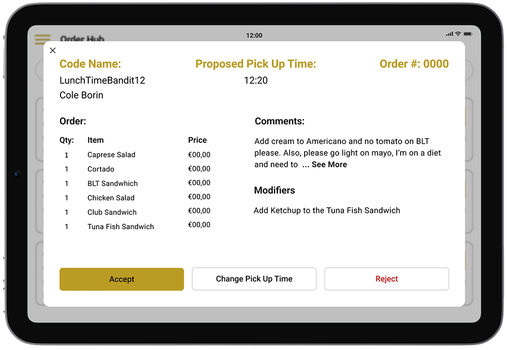
Get a full view of the order
Information from the client
The Users

The average worker
Restaurant owners to snack bar workers. The user profile of the restaurant facing side of the application was one of the key parts was one of the key pieces of information that was provided by the client. The users for the restaurant facing side was defined as the every day worker in restaurants, cafés, snack bars, or anything that would participate in takeout orders. This means that the user for FoodBadger is a very wide group of people so many factors had to be taken into account.
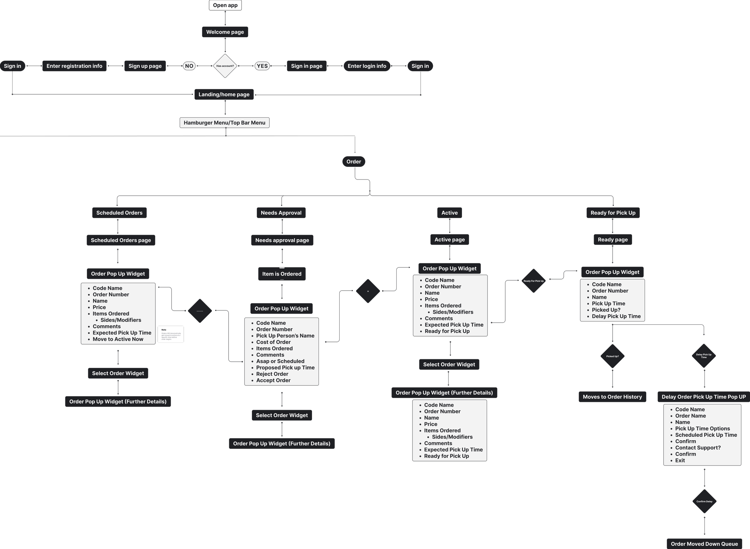
The next piece of information that we received from the client was a draw.io file containing their idea of what they wanted for the restaurant facing side of FoodBadger. The inspiration of the clients idea came from a system known as Walt, the industry leader for takeout ordering in Europe. This was an important file for me and my team as it gave us some insight for what the client was looking for. But more importantly it allowed us to see what the client thought would be the most user friendly, which allowed us to create a very teachable moment as we were able to then both teach them and lead them in a different direction.

Research
After we received the information from the client we moved on to doing our own research
Using the information the was provided to us by the client, we started doing our own research. This involved to main areas of focus. The first was looking at industry leaders both in the US and in Germany. This allowed us to find features that were considered the standard and also better understand which features were often used by German and other European food ordering services that we were not previously familiar with. The second was to go and speak with restaurant owners and workers to find out what is most important to them when they are interacting with different food ordering services.
Keep it simple
The biggest piece of information that we found was to keep everything as simple and intuitive as possible. The workers could be anyone from a 14 year old child in school who is very tech savvy to a 60 year old business owner who calls their grandkids for tech advice.
Lay it all out
Having all the tabs and options directly in view may seem like it would clutter everything but in the world of fast moving restaurants, having everything laid out in front of the user allows the user to move much faster than clicking and clicking through tabs.
Organize by type
Again for the fact that moving fast is important, having all order types neatly organized and well labeled into sections that are all accessible from the home page view aids in the users ability to move quickly. This is a trait that is apparent in all industry leaders.
The Design Process
User Flows
The first thing that we did after conducting our own research was to direct the user flow that they gave us with the draw.io file. From there we were able to get a better sense of how the client wanted things to flow and then were able to incorporate the findings from our research.
The first part of the flow that we constructed was the for the orders side of the application. Here the main focus was to have everything be well organized while also being laid out in front of the user so that they were able to move quickly through each of the sections needed to move a order from start to finish. It was very important to nail down a good flow for the orders side as it is the main feature that the restaurant will be interfacing with the most.
The second part of the flows that were constructed was creating the menu side. The menu side was the more difficult of the two to create. This came from the limitations of what FoodBadger was able to do on an infrastructure side as well as what was allowed for regulation purposes, mainly the ability for the client to edit a menu on their own. Because of this, we had to spend a lot of time thinking on the aspects that the restaurant were going to be able to edit. All of this lead to the flow that you see to the left.

Wireframes and screens
After a few rounds of going back and forth with the client on different flows, we were finally ready to make wireframes and then eventually high fidelity screens.
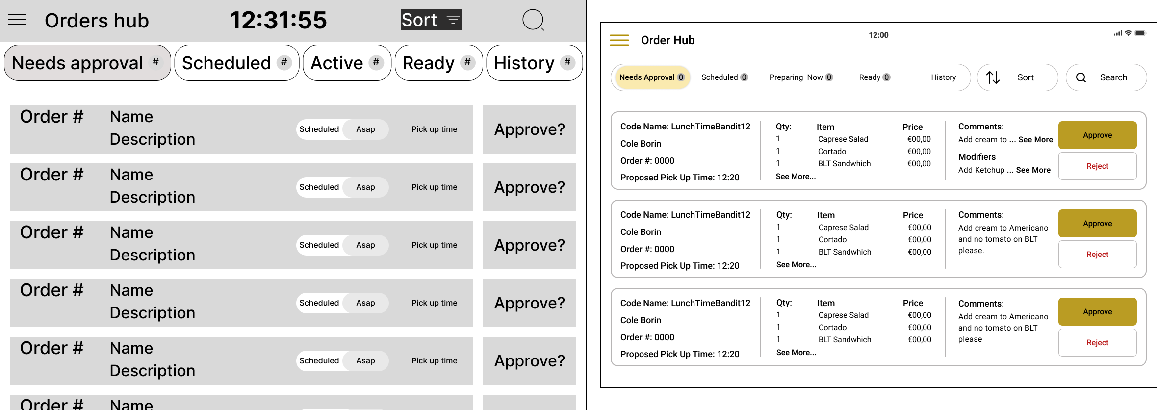
Needs Approval
The first page in the orders hub that was designed was the “Needs Approval” page. This is the center for all orders coming in. From here the restaurant is able to view the orders that are coming in and also preview what the order is. It also serves as the section where the restaurant can see what the preposed pickup time is and change it if needed.
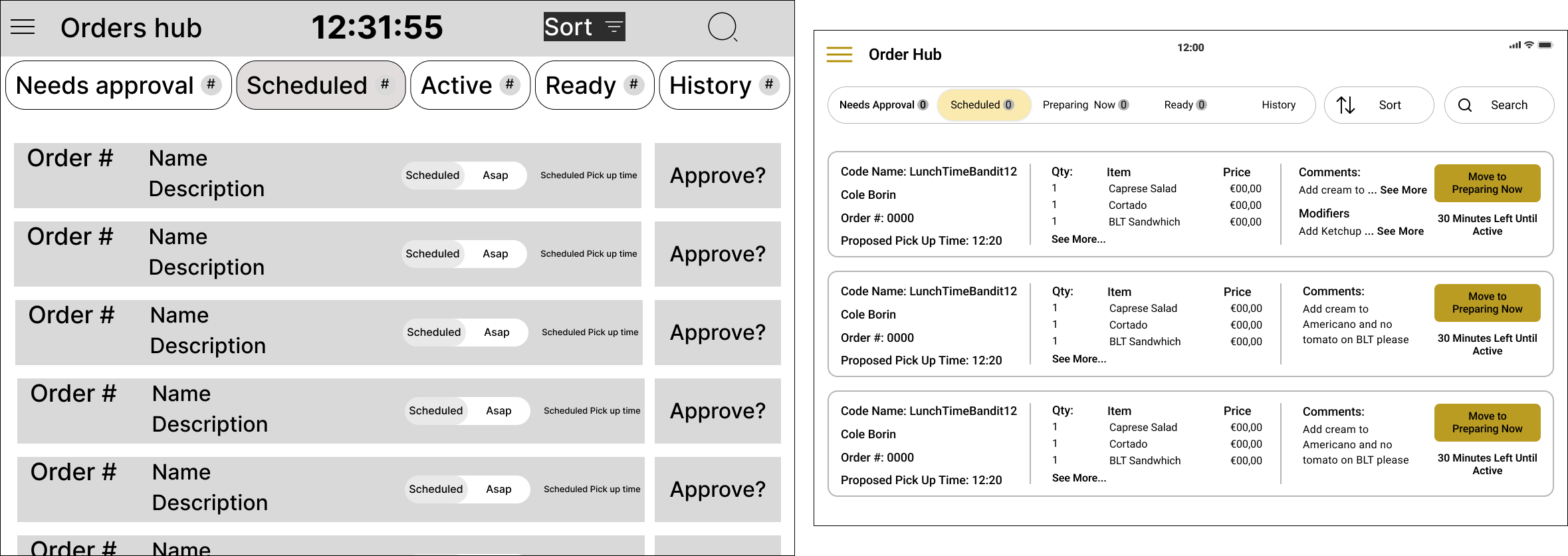
Scheduled Orders
“Scheduled Orders” is the next tab in the navigation bar. This tab serves to display all the order that have come in and been approved but are set to be picked up later in the day and are not as immediate. From this tab, the restaurant is again able to see what is in the order as well as the necessary order information. The restaurant is also able to see how much time is left until the order gets classified as active and moves to the “Preparing Now” tab. The restaurant is also able to manually move the order to the “Preparing Now” tab is they so choose.
Preparing Now
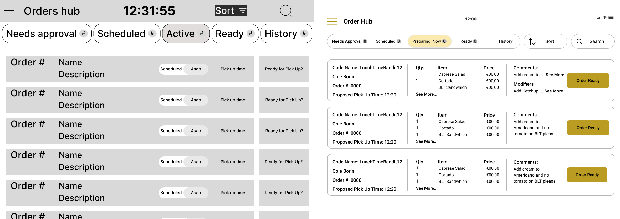
The third tab in the order hub’s navigation bar is the “Preparing Now” tab. This is the tab that has all the orders that are currently being prepared. Here the restaurant is able to click on an order to see a larger view of it as well as move the order to the ready tab as soon as the order has been completed.

Ready Orders
“Ready Orders” is the final tab that is available to the restaurant, other than history which is a back log of the orders. In this tab, there is a running list of what orders have been completed and are ready for pickup. The restaurant is able to move an order to history after it has been picked up by hitting the “Picked Up” button. Additionally, the restaurant is able to move an order further down the queue if it has been a while without the order has gotten picked up so that the top of the list doesn’t get as congested.
Menu
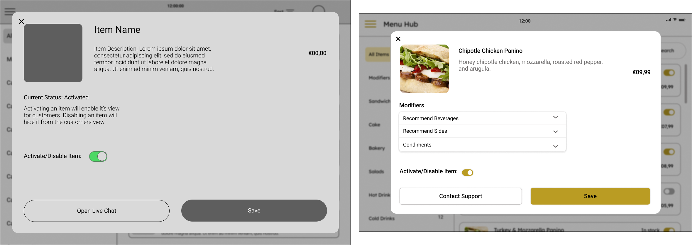
The “Menu” page is where the restaurant can see the current menu that they have as well as see what different modifiers are available for the different menu items. The restaurant is also able to toggle if a item or modifier is available or not by activating/deactivating the item.
Prototypes
After we completed making the wireframes and higher fidelity screens, and then cleared them with the client, we moved into prototyping a final version and tested with users. Bellow are the final version of the product that was delivered to the client.
Needs Approval
Here you can see how the restaurant would go about about moving through the “Needs Approval” tab. The user is able to view the whole order, accept or reject the order, and contact customer support.
Scheduled
In the “Scheduled” tab, the user can view a larger version of the order, move the order to the “Preparing Now” tab, contact support, and view how much time is left until the order is deemed active and automatically gets moved into the “Preparing Now” tab.
Preparing Now
It all begins with an idea. Maybe you want to launch a business. Maybe you want to turn a hobby into something more. Or maybe you have a creative project to share with the world. Whatever it is, the way you tell your story online can make all the difference.
Ready
In the “Ready” tab, the restaurant is able to mark a order as picked up once its been picked up, contact support from a enlarged view, and move the item down the queue if the customer is taking longer than expected to pick up their order.
Menu
Finally the “Menu” tab is where the restaurant can see what they have on their current menu and then toggle if the item is available or not. The restaurant can Alsop see what modifiers are available per item they have on their menu.
Conclusion
In the end, this project was a huge learning experience for me. Working with a team based all around the country who were all working asynchronously and with a client that was located in a different country was very eye opening experience for me. I learned a lot about communicating both with the client and with my team members. This project showed me the importance of teaching others who are not as experienced in UX design about the best practices and how to truly be an advocate for the user. When the project was all said and done though, it was very rewarding to see a product that we had created that it going to market soon and working in conjunction with the other aspects that we didn’t design ourselves.
If I were to do it again
If I were to do this project again, there are a few thing that I would do differently. First is that I would focus on being more direct with the client in terms of timeline of deliverables so that they do not keep us stuck on the same section without forward progress. Second is that I would focus on teaching more about UX principles right off the bat so that the client is understanding of where we are coming from. Third, and arguably the most important, is to communicate more often than I think is necessary with the client. While internal team communication happened often, communicating more with the client would have lead to faster work overall.